

Raleigh is one of the world's oldest and best known bike brands. It has been continuously producing quality bicycles since 1887 and has a loyal following. In today's world of relentless competition and price-driven strategy, Raleigh needed to realign and extend it's brand awareness about it's heritage, increase it's relevance and give cyclists more reasons to choose Raleigh Bikes.
STAYING TRUE TO RALEIGH'S ROOTS
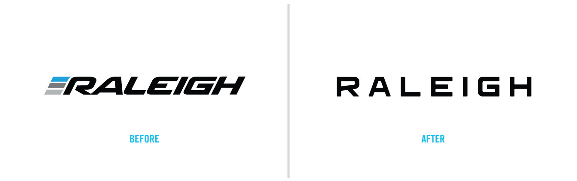
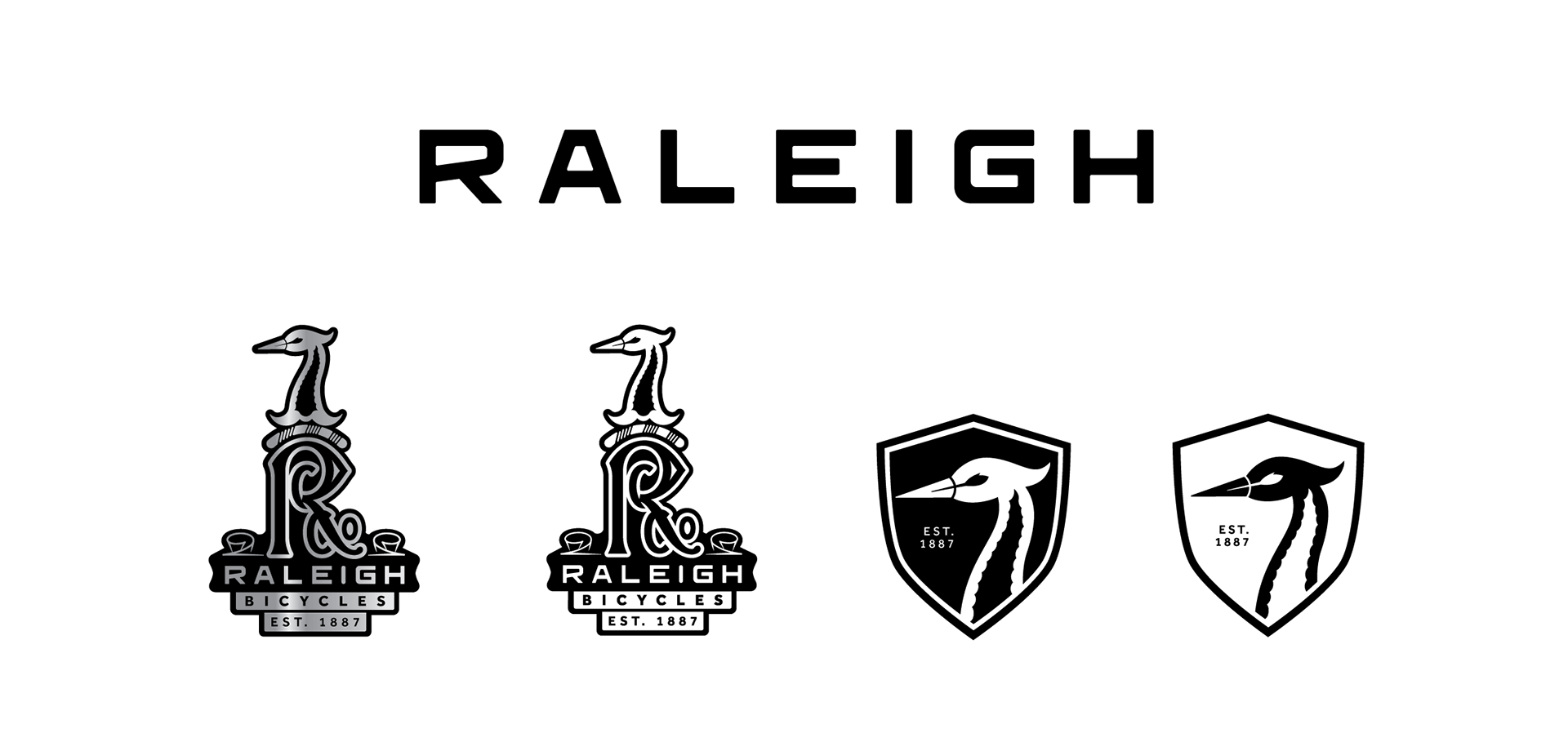
After reviewing Raleigh's current brand guidelines, my first objective was to align the brand around one identity that would hold true to Raleigh's heritage while modernizing it to appeal to today's customers. The brand had been using multiple logo variations at the same time. My next goal was to take this evolved single brand direction and then apply it across all aspects of the brand journey. I started the project by researching Raleigh's history and how it evolved over 130+ years.
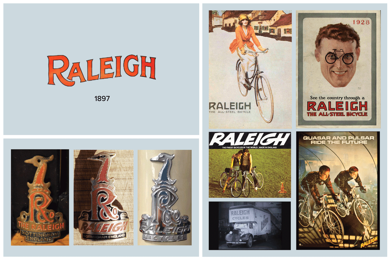
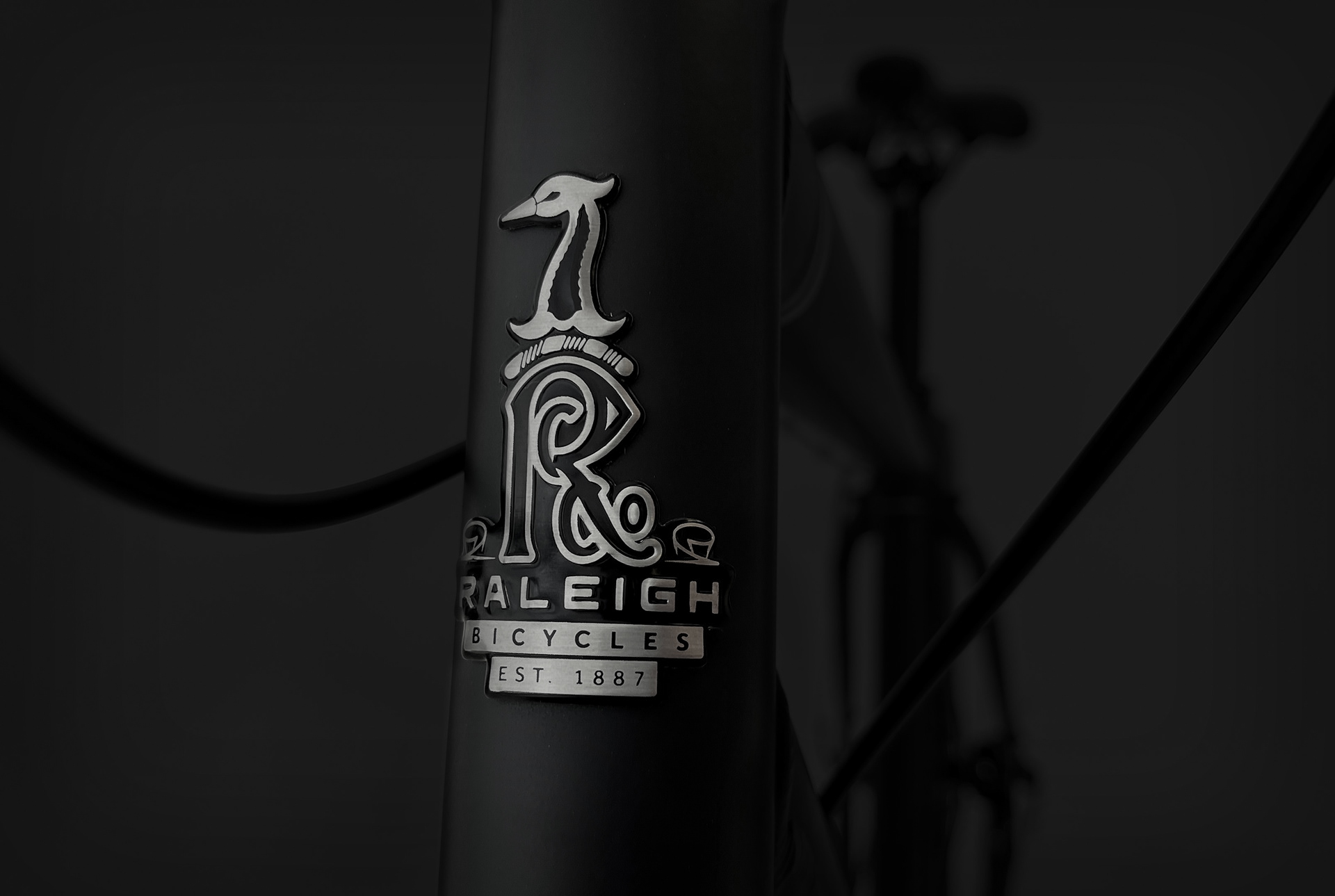
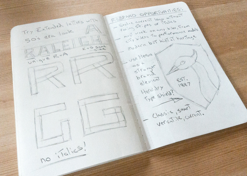
The bicycle head badge Heron and Monogram has stayed fairly consistent over time, while the brand wordmark has changed considerably. I set out to evolve the Raleigh wordmark logo that hinted to it's heritage while pointing towards the future. My next goal was to use the Heron as a stronger element within the brand structure. Lastly, I wanted to highlight the companies legacy and longevity as a secondary message on the head badge.
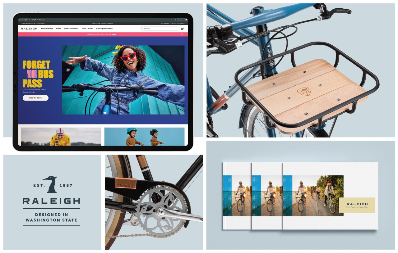
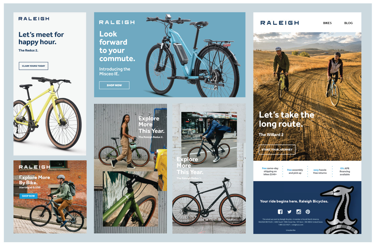
Application examples across brand touch points, including products and marketing.
More bicycle and design language examples can be found here.